100% Pure Website Redesign
I was the sole UX designer and project manager tasked with redesigning 100%PURE’s website.
Client
100%PURE/Purity Cosmetics
Year
2023
The Problem:
The CEO of 100%PURE, a leader in the clean beauty space, hired me for a website revamp that has been in the works for years but had never been accomplished.
My goal: Redesign the existing website to be up-to-date with other cosmetics websites while improving usability and increasing user conversion rates.
The Research:
I started with a landscape review of other cosmetics companies. I had an idea from my discussions with Rick, Purity Cosmetics' founder, of what features he would like to see added and noted how they were incorporated on other websites. I also looked for common themes between competitors had that could be incorporated into the new site. I compiled my insights in the table below.
Due to the time restrictions surrounding the project, I could only conduct informal usability tests where I asked my friends and family to use the website and share their thoughts. This exercise helped me get a sense of our target demographic.
“The text for the product is way too small, and...the focus should be more on the product details rather than the videos.”
- My friend and willing participant
I conducted a deep audit of improvements I saw could be made on the existing site (pictured), focusing on the home and product pages as they gained the most traffic. Some issues I found included confusing information architecture of the navigation menu, usability issues, and outdated design choices.
Key Insights to Inform the Redesign:
💡 Draw inspiration from competitors—look to others within the beauty space to ensure an up-to-date and relevant design.
💡 Adhere to design heuristics—improve usability by incorporating heuristics such as minimalist design, recognition rather than recall, and maintain consistency and standards.
💡 Design for the consumer—keep in mind 100%PURE’s main demographic, women between the ages 55-64.
The Wireframes:
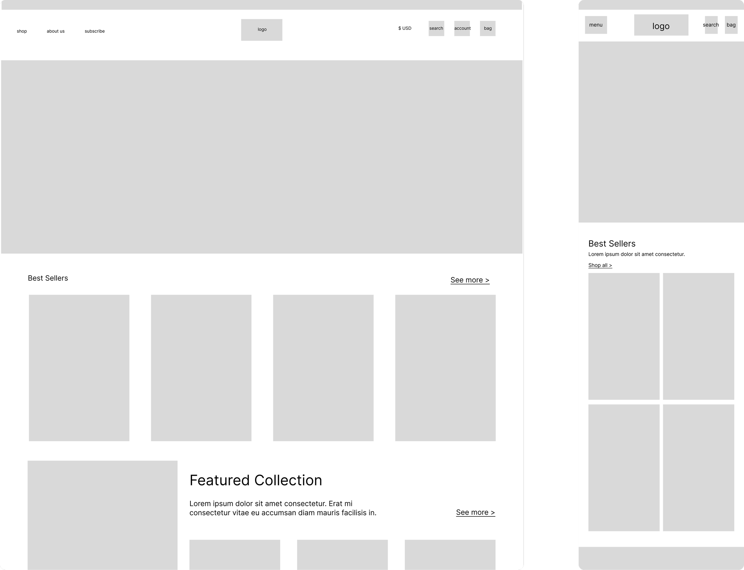
Based on stakeholder feedback and the knowledge I gathered from my landscape review, I put together lo-fi prototypes of possible layouts for the redesigned pages. I also checked with our developers to ensure the feasibility of various new features I hoped to add.
I also conducted a few usability tests with friends to see if the user flow made sense before starting hi-fi prototyping. Based on their feedback, I restructured the navigation menu and reduced the items per row from 5 to 4 to reduce visual clutter.
The Final Product:
Using 100%PURE’s brand guide to create a living library of design systems and assets, I created high-fidelity prototypes of the site on Figma.
The redesigned home page features a “Shop By” category, media features, and personalized beauty quizzes.
The redesigned product page includes a key ingredients section, an infographic of user reviews, and all key information located above the fold.
I successfully re-hauled the main navigation menu, creating simpler groups that rely less on hover interactions. (old vs. new navigation pictured below)
Similarly, I also restructured the footer menu. In both instances, I aimed to target recognition in the user rather than recall. (old vs. new footer pictured below)
I handed these designs off to the contract development team, holding bi-weekly stand-ups to oversee their progress, conduct quality assurance, and address any issues that arose. After multiple rounds of feedback, testing, and tweaking, the final product is now live on the 100%PURE website.
My redesigns resulted in a 7% increase in user conversion rate.
The Takeaways:
This was my first time doing 100% of the designing for a new website and project managing for a small group of developers, IT techs, and marketing specialists. It was super interesting seeing how a real business works, and designing for e-commerce. I learned a lot thanks to the mentorship of Rick, Mac, and Kelly, who worked closely with me throughout the process. I look forward to taking on more web design projects in the future!


