Study Buddies Interactive Kiosk
For this advanced design course I took at UCSD, our final project was to create an interactive kiosk that combined both digital and physical design. This is the product our team built.
Course
DSGN 100: Prototyping
Year
October - December 2023
Team
Kaitlyn Chin, Ava Rubin, Bella Chen, Jacob Zhong
The Problem:
My team and I decided to design an experience for educational contexts such as classrooms, lecture halls, and libraries. We wanted to tackle an issue we found prevalent among our peers and something we all had struggled with ourselves: lack of student productivity.
Our Goal: How might we make being productive as a student not only easier, but more enjoyable?
The Research:
With our goal in mind, we set out to do user research in an environment we knew students might go to when having this issue: our school’s library. We conducted field observations of other students in the library, where we noticed many distracted students on their phones, usually with a laptop or another device open in the background containing their actual work.
we’ve all been there…
We also conducted 6 user interviews with students working in the library, asking about their study habits in the library and what prevents them from doing their work.
“I notice when I'm at home or late at night I’ll go on my phone too much. Sometimes I have to go into my room, throw it somewhere, and go back so I'm not on my phone.”
- student interviewee
Main Insights:
💡 Many students cited their phones and online notifications as significant distractors while trying to study in the library.
💡 Students come to the library to study because they want a quiet space, free of distractions, and often use noise-cancelling headphones to block out any noise.
💡 Students find it easier to focus when alone because they might get distracted by conversation if they study with friends.
The Target User:
From both our observations and user interviews, we created a user persona to encapsulate our target user.
We also brainstormed user scenarios and storyboards, illustrating potential solutions for improving productivity in the library. We then converged on one solution we thought had the most potential and met our design goals the best: a study kiosk with productivity motivators and a phone lock-box.
Ideation and Lo-Fi Prototyping:
We compiled a feature list for our kiosk, split into the function of each feature relative to our goal. From our competitive analysis, we learned about the Pomodoro Technique, a popular time management method among students based on 25-minute stretches of focused work broken by five-minute breaks, which we also incorporated.
Our initial user flow looked like this:
We then began sketching wireframes for both the digital user interface and the physical body of the kiosk.
We worked on our physical interactions by paper prototyping and trying our flow out with real users.
For the design of our digital component, we made a mood board, based on which we created a style guide for our interfaces.
The Hi-Fi Prototyping:
Using feedback from our lo-fi prototypes, we created a high fidelity version of our kiosk from scratch. We used Figma to prototype our digital application which we designed to fit the screen of an iPad Air. We then used an Epilog laser cutter and Inkscape to build the physical kiosk out of ⅛”-thick plywood.
We then presented our completed Study Buddies kiosk to our class, who got to be real users and try out our kiosk for themselves!
The Final Digital Flows:
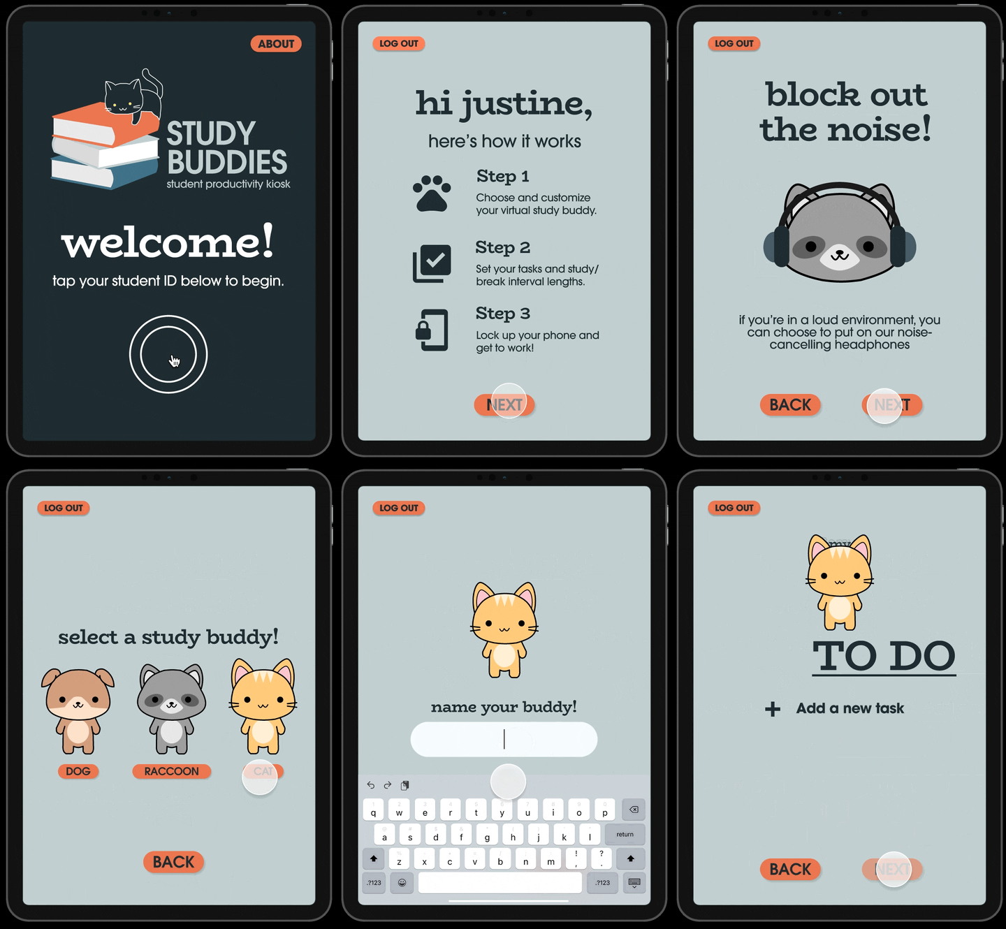
The final digital interactions are below, from getting set up, studying and completing tasks, to customizing your Study Buddy.
Onboard and create a Study Buddy.
Create your to-do list, set your study intervals, and lock up your phone.
Check off tasks and finish your work block.
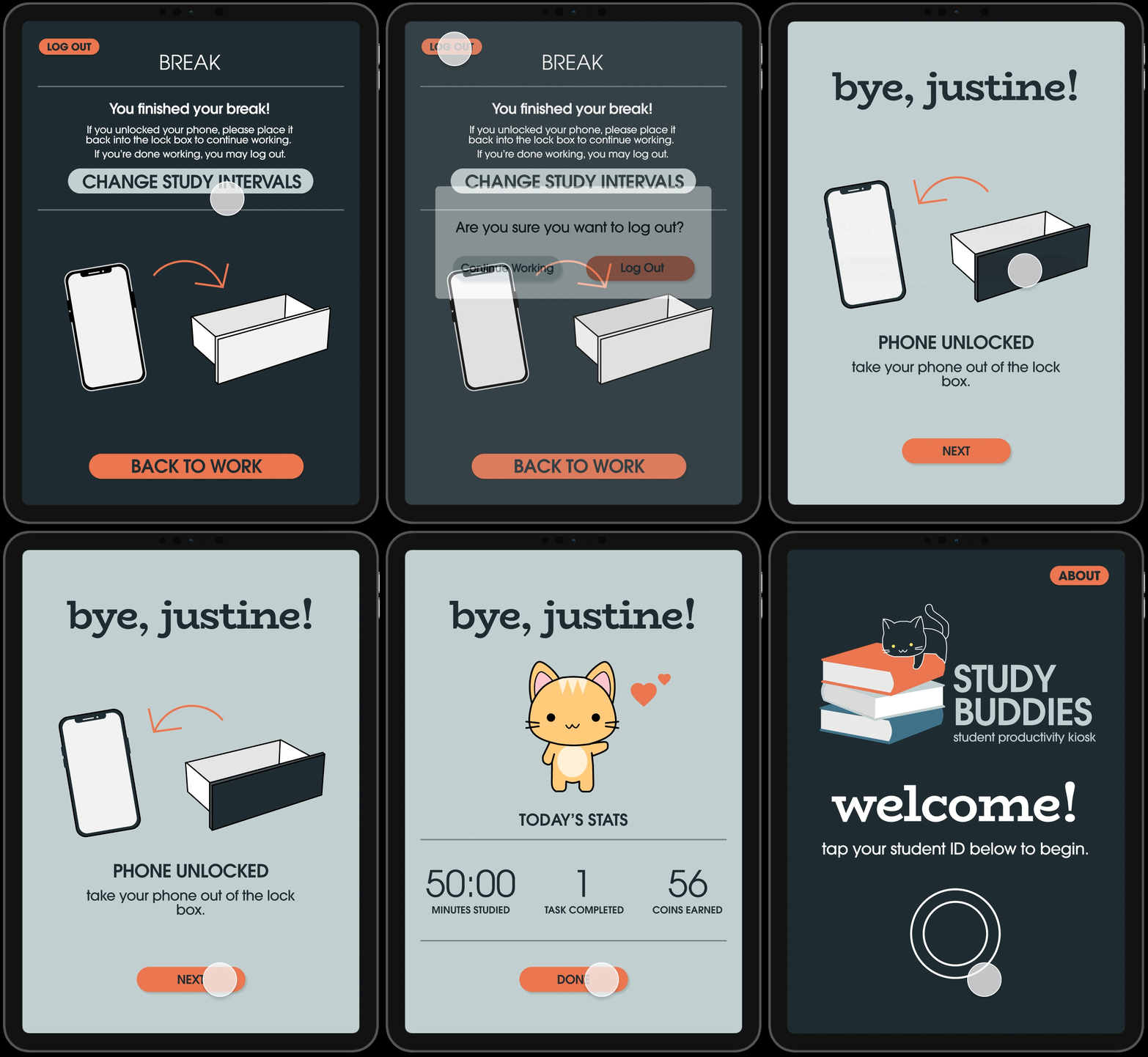
Choose what to do during your break. ⬇️
You can unlock your phone or...
Spend coins to customize your study buddy.
Log out when you’re done and see a summary of what you’ve accomplished.
The User Testing:
We then brought our kiosk back to the library to conduct user testing in the context it would be used. We asked real students to try out our kiosk and gave them authentic tasks to complete in order to replicate the entire user flow.
We then asked them about their experience and what they thought could be improved. Some major findings we saw after 4 user tests:
The feature users found the most useful was the phone lock-box.
2/4 of users were confused when they saw the phone unlock screen at the end.
2/4 of users liked the Pomodoro timer and mentioned that they already use something similar.
This feedback gave us some design considerations for future iterations of Study Buddies:
Future Improvements:
Add clarification while the user is setting up the phone to be locked up later
Make the phone lockbox larger to fit more phone sizes
Consider edge cases and accessibility features for differently abled users.
Integrate AI into the kiosk for an enhanced experience
The Takeaways:
I had such a great time working on this kiosk and am so proud of the finished product my group and I were able to produce! It was especially unique combining digital prototypes with the physical shell of the kiosk itself and building it completely from scratch. While there were definitely many roadblocks, especially with building the physical frame of the kiosk, I learned how to use failures as an opportunity to improve rather than discouragement. Shoutout to the Design Lab @ UCSD for providing us with the material, space, and resources to complete our kiosk and to my amazing teammates!


